Learning Elementor

Introduction to Elementor

What We'll Learn

In this section, we’ll be going over how to use Elementor, which is our chosen pagebuilder/editor. This is our gateway to creating pages and editing the content on them. Most of your time will be spent here, so be sure to get a good understanding of how it works!

Getting Started

When you first load up Elementor, you’ll be greeted with a blank page and a sidebar full of different elements. These elements range from basic text and images, to advanced video feeds and Google maps functionality. Elementor is a drag and drop editor, meaning we can drag our elements. also known as “widgets,” directly onto the page.

Start by clicking on the element labeled “Heading,” then dragging this onto the center of the screen where it says “Drag widget here.”

If you misclicked and can’t find your elements section, then you can click the  icon at the top of your sidebar to bring you back.

Once you have your heading in place, you’ll see an editing window come up in your sidebar. This is where you can set the element’s text- though this can also be done by clicking inside the element itself.

Changing Styles

At the top of your sidebar, you’ll notice that there are three tabs listed: Content, Style, and Advanced. These all have to do with editing different aspects of your current element. From the Styles tab, we can change the text color, typography (font choice, text sizing, and more), and add a shadow to our text. These options will be different depending on the element you’re editing.

Going to the Advanced tab will give you more options for your element, such as an entrance animation, border, and background. Bear in mind that the border and background options can sometimes be found in the Styles tab instead. This depends on the element itself, and may require you to check both tabs to find them.

Element Encapsulation

Many pagebuilders will use an encapsulation system to make editing easier. What do I mean by that? Well, every element you place will be contained inside of a column, which in turn will be inside of a section, or row. Sections are horizontal areas that contain any number of vertical columns; these columns can all be different sizes. When you created that heading element, it also created a section with a single column. This whole paragraph is an example of a single-column section. If I were to add a second column, it would look

Like

This.

I’m using two headings for this example, both of which are left justified. You can add more columns to a section by right-clicking on the top left 
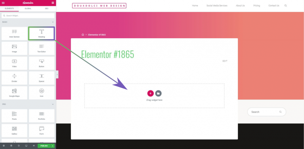
icon. You can also use an element called an Inner section to turn one column into multiple.

Adding Borders in Elementor

What We'll Learn

This article is all about adding borders to your section, column, or element. Or, all three! Borders are typically used on buttons, when highlighting text, and to create appealing effects. 

Creating a Border

To create a border around an element, go to Advanced >> Border and select a Border Type. For sections and columns, this will be found under Style >> Border. There are two main attributes of borders: width and radius. Width defines how thick the border is, while radius will curve the edges. Every border has a top, bottom, left, and right side. To change their attributes individually, click the un-link  icons next to width and radius.

Making Beautiful Buttons

Button borders work similarly to other elements, but with an interesting quirk. Like normal, borders are added through the Style tab. However, there’s also an option to add them under the Advanced tab. Using this tab will give odd results, and is best stayed away from.

Here’s a button that has both a normal and a hover border. If you’re unfamiliar with hover effects, then you should check out the article on Setting a Background.

So how was this made? Well, I created a normal border so that the button doesn’t seemingly change size when hovered over. And the normal background was made by picking a random color and setting its opacity to zero (this is the slider at the bottom of your color picker).

Framing Text

Another example of using a border is to frame text, either partially or completely.

Some Great Text

Lorem ipsum dolor sit amet, consectetur adipiscing elit. Ut elit tellus, luctus nec ullamcorper mattis, pulvinar dapibus leo.

Some Even Better Text

Lorem ipsum dolor sit amet, consectetur adipiscing elit. Ut elit tellus, luctus nec ullamcorper mattis, pulvinar dapibus leo.

Advanced Tip: If you’re looking to be extra fancy, you can add a Wrapper Link to this column and have the entire thing be a makeshift button.

Setting a Background in Elementor

What We'll Learn

So you want to add a background? Well, there are several different kinds of backgrounds to choose from, including images, solid colors, gradients, slideshows, and videos. These options will change depending on if you are editing a section, column, or element.

To add/change a background for an element, go to Advanced >> Background. For a section or column, you’ll be going to Style >> Background. When you’re there, you’ll immediately notice the options “Normal” and “Hover.” Normal refers to how the background looks, well, normally; while Hover can allow the background to change when someone hovers their mouse over it. Note that you need to have both a Normal and Hover background set up in order for the Hover effect to work.

Solid Color & Image Background

First start by clicking on the “Classic” box next to Background Type. You now have the choice to add either a color or image background. Choosing color will give you a color picker popup, with your saved colors at the top and hue and opacity changers at the bottom. You can save your current color by clicking the plus button near the top.

When adding images, you’ll be asked to provide an image from your media library, or to upload a new one. To get your desired size and position, you’ll have to play around with the different options available.

Tip: setting Attachment to Fixed will give a very appealing scrolling effect.

Example of hover effect with solid colors (don’t forget to set a transition duration under Hover). 

This method works great when making buttons.

Gradient Background

A gradient is a smooth transition from one color to another, in either a straight line or radial direction. You can see popular examples of these in both Instagram and Hulu’s logos, and plenty of them can be found on this site. Modern examples often sport rather bright colors, but they can also be used with more subtle shades. Clicking the “Gradient” box next to Background will bring up several different options- start by choosing a color at the top of the section. Congratulations, you have a gradient! As for the other options, it’s actually easier for you to learn these yourself than to have them explained to you.

Slideshow & Video Background

This can look great for the front page of your site, as it’s an engaging way to show off your business. Text can be layered on top to introduce your business and tell your audience what you’re all about.

Delicious Food

This is an example slideshow, using a Ken Burns effect. 

Images are from Unsplash.com. Mae Wu- cookie basket, Patrick Fore- dough, Ales Krivec- cutting board with cookies.